Pied Oxen Printers

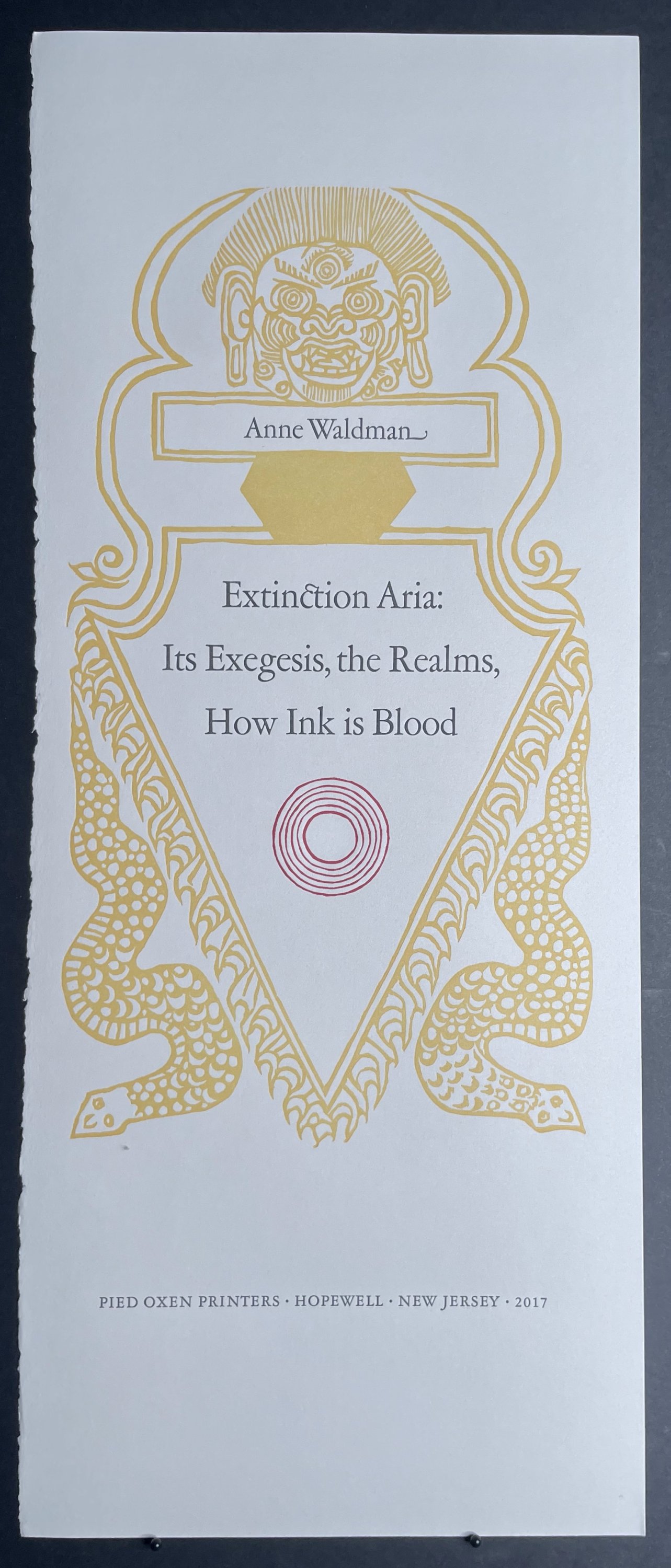
Anne Waldman
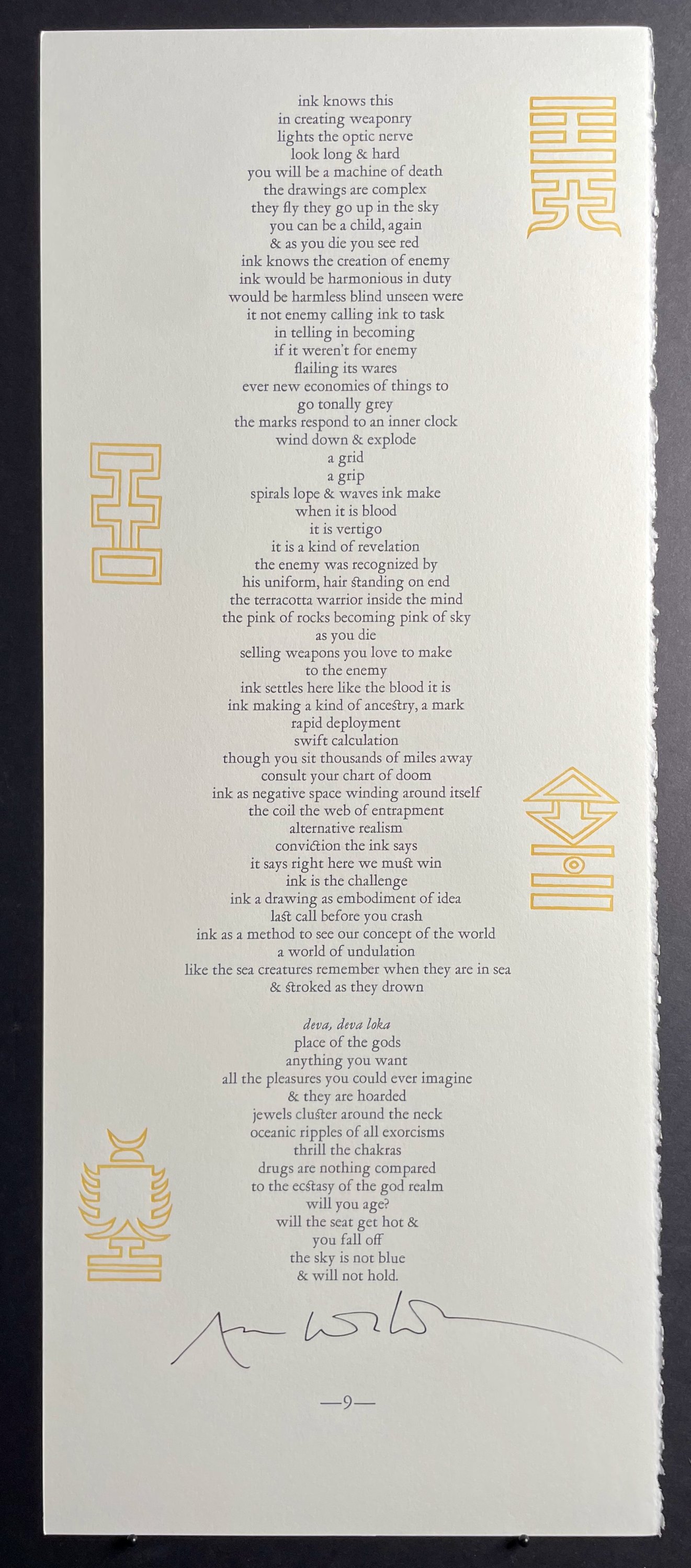
Extinction Aria
Its Exegesis, the Realms, How Ink is Blood
$6000
Item Details
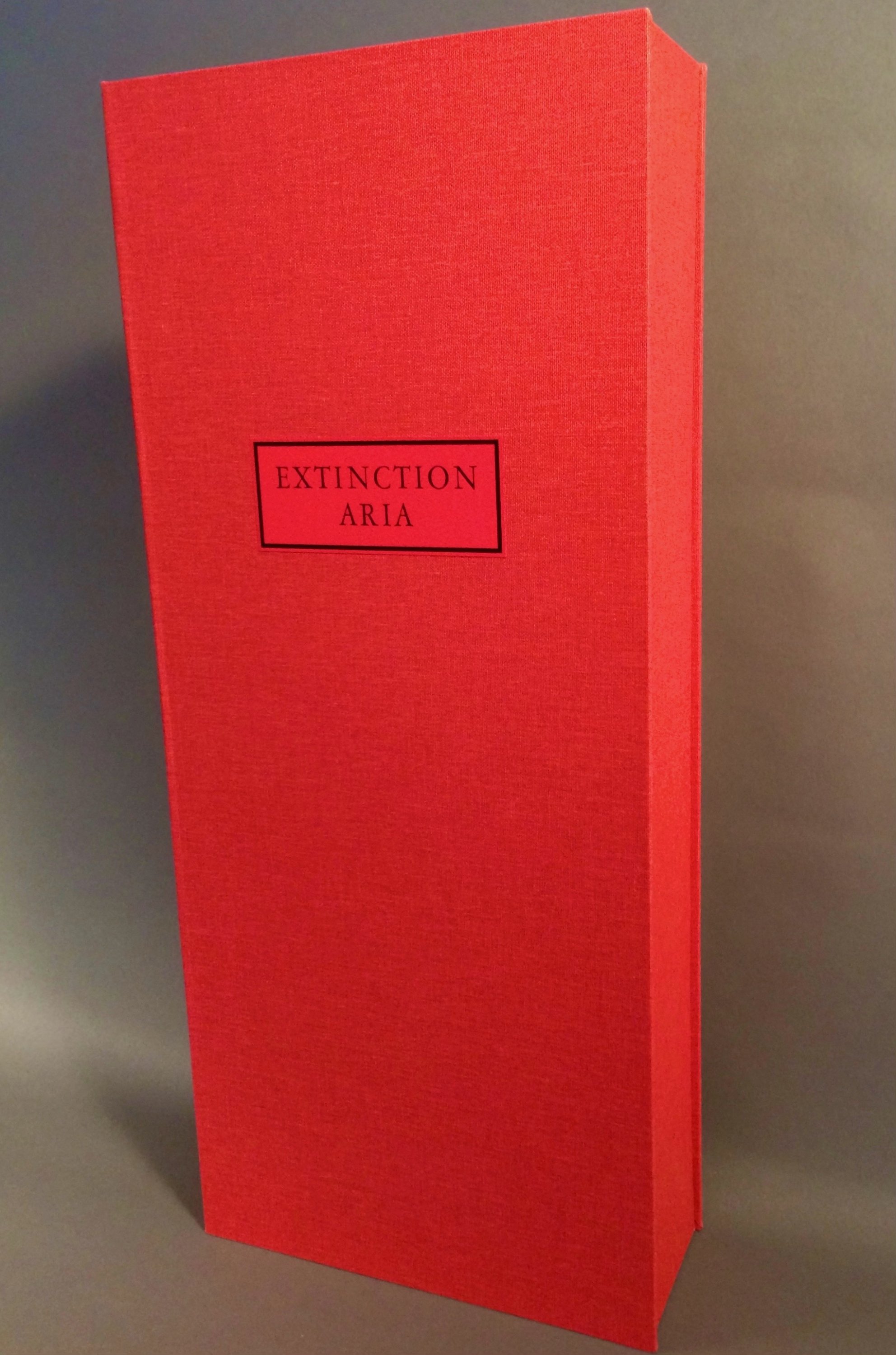
Hopewell, NJ, Pied Oxen Printers, 2017, patinated copper, book cloth covered clamshell box, silk wrap.
One of 20 special copies of total edition of 60, new.
The text seemed to emanate from a vibrating larynx and dance in the air…The image and insistent repetition of “ink”…came from a dream that inflected the power of ink as a kind of lifeblood for poetry. Anne Waldman
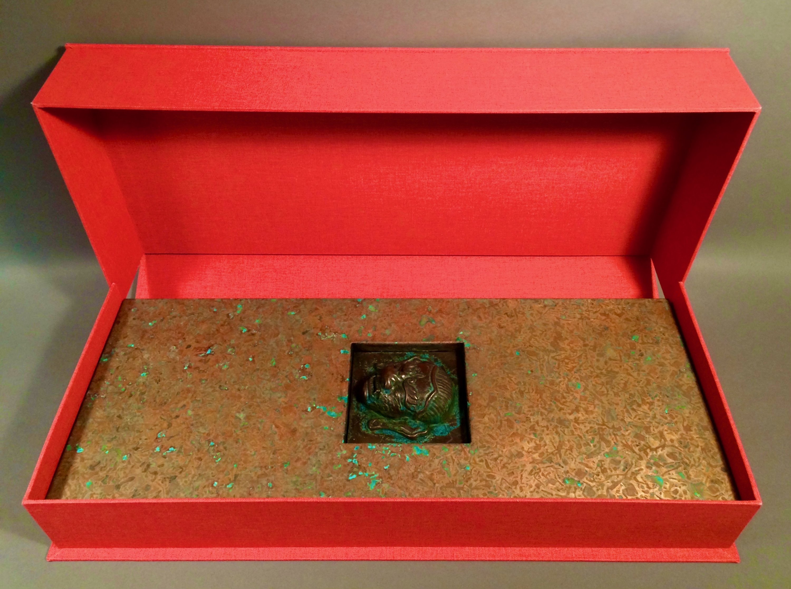
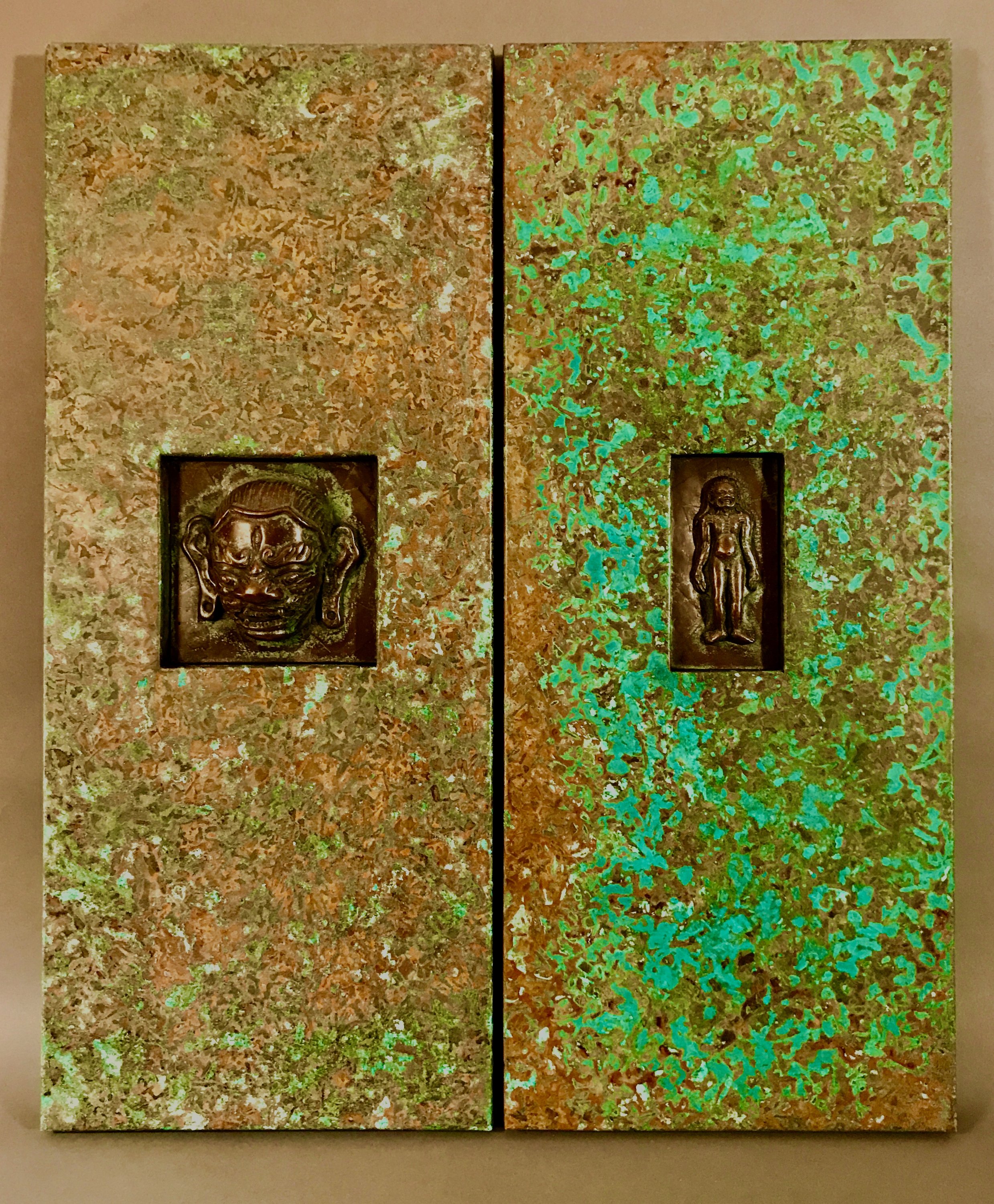
Large oblong folio, in two versions: (1) special patinated copper-clad covers with two cold-cast bronze figures numbered 1-20, in a red buckram covered clamshell-style box, 15 leaves, ff. [3], pp. 9 verse printed recto only, ff. [3], 4 x 10 3/4 x 24 3/4 inches; (2) regular linen covered copies numbered 21-60, in a wheat yellow buckram covered clamshell-style box, 15 leaves, ff. [3], pp. 9 verse printed recto only, ff. [3], 1 1/2 x 11 x 24 3/4 inches. This copy is one of 20 of the special edition.
Notes: (1) Copies are assembled as ordered. Allow four to six weeks for delivery. (2) The patination process is inherently serendipitous and each copper-clad copy will be unique (see images).
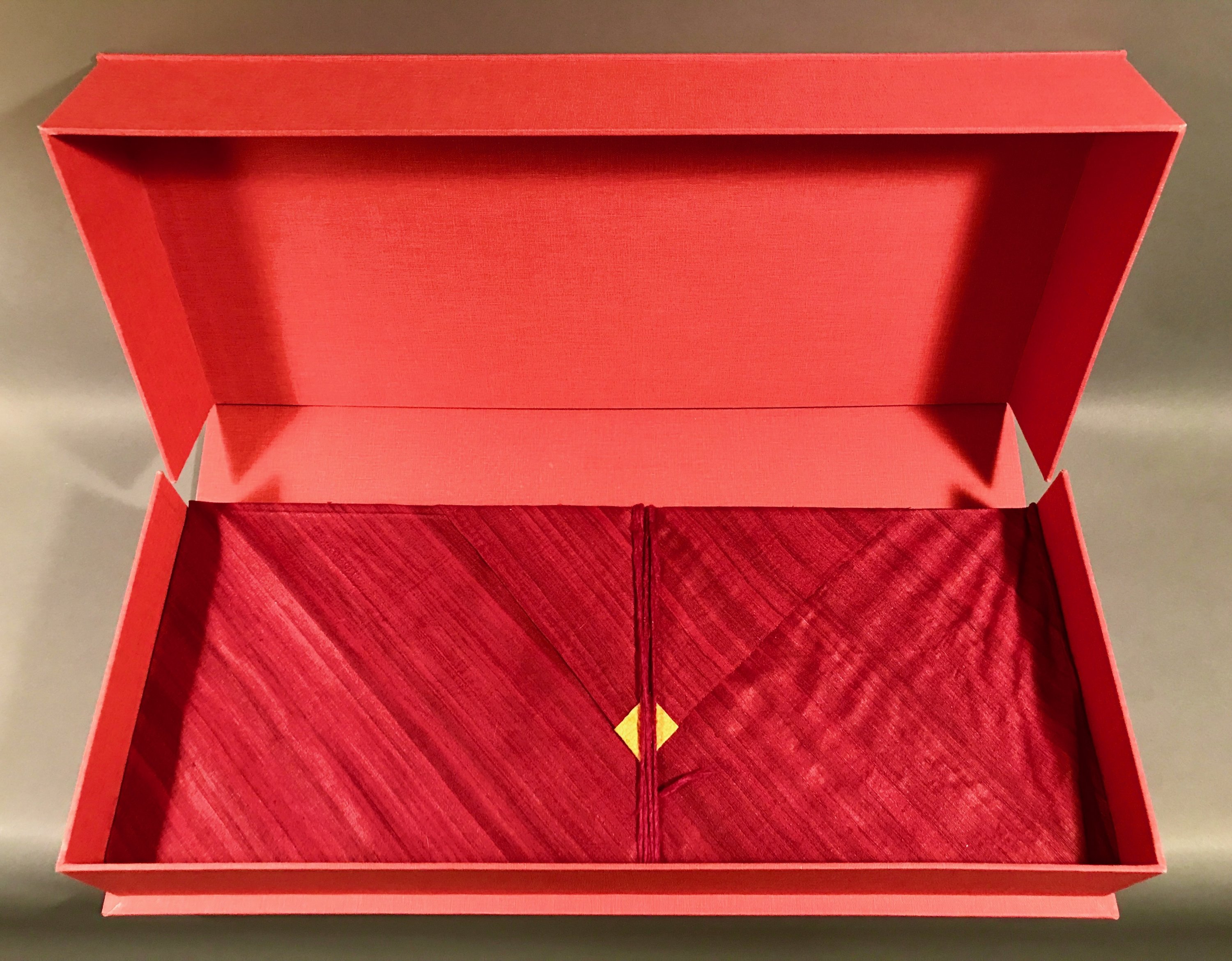
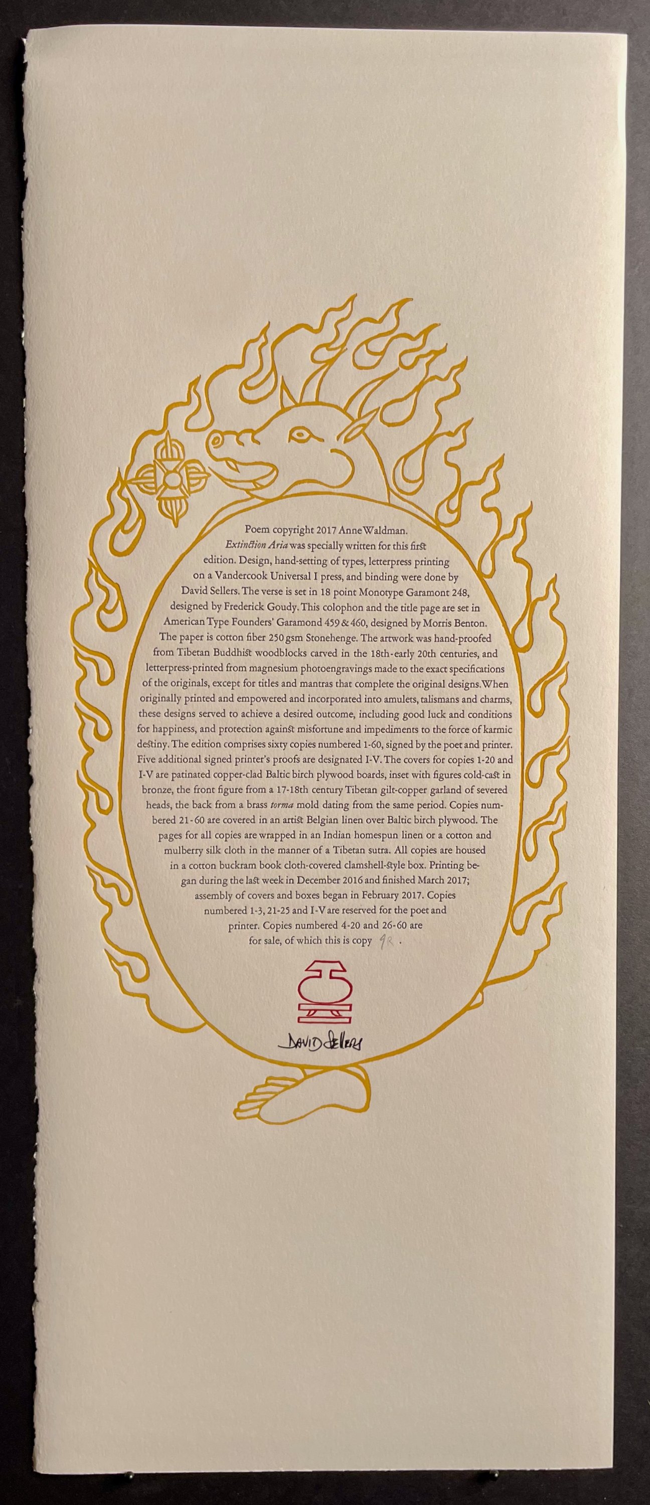
The Edition: "Extinction Aria" was specially written for this first edition. The artwork was initially hand-proofed from 50 Tibetan Buddhist woodblock images carved in the 18th-early 20th centuries, and letterpress-printed from type-high magnesium photoengravings made to the exact specifications of the originals. The type for the 501 lines of verse is 18 point Monotype Garamont 248, designed by Frederick Goudy, and for the title page and colophon, American Type Founders’ Garamond 459 & 460, designed by Morris Benton. The paper is 100% cotton fiber Stonehenge. The pages for all copies are wrapped in Indian homespun and handloom wild Mulberry or Bhagalpur silk fabric,** tied by a single strand of Nepalese silk yarn, in the manner of a Tibetan sutra. All copies are housed in a cotton buckram book cloth-covered clamshell-style box. Design, hand-setting of types, letterpress printing on a Vandercook Universal I press, covers, including casting and patination, and box-making are by David Sellers. The edition comprises sixty copies numbered 1-60, each signed by the poet and printer. Five additional signed printer’s proofs are designated I-V. The covers for copies 1-20 and I-V are patinated copper-clad Baltic birch plywood boards, both inset with figures cold-cast in bronze. Copies numbered 21-60 are covered in artist’s Belgian linen over Baltic birch plywood with a recessed letterpress-printed cover label. **Wild Mulberry and Bhagalpur silk are often referred to as 'non-violent silk' or 'Ahimsa silk' since they are only harvested after the moths have left the cacoons and none have been killed in the process. Due to its non-violent origins, this 'fabric of peace' is favored by Buddhist monks around the world.
The first available linen copy was acquired by the Library of Congress, Rare Books and Special Collections; the first patinated copper copy was acquired by Yale University, Beinecke Rare Book and Manuscript Library.
Recorded performance: Each copy includes a download card for an extraordinary performance of "Extinction Aria" by Anne Waldman & Chilean poet, artist, and filmmaker Cecilia Vicuña, together with musician & composer Ambrose Bye.
Additional information about the poet: https://www.annewaldman.org
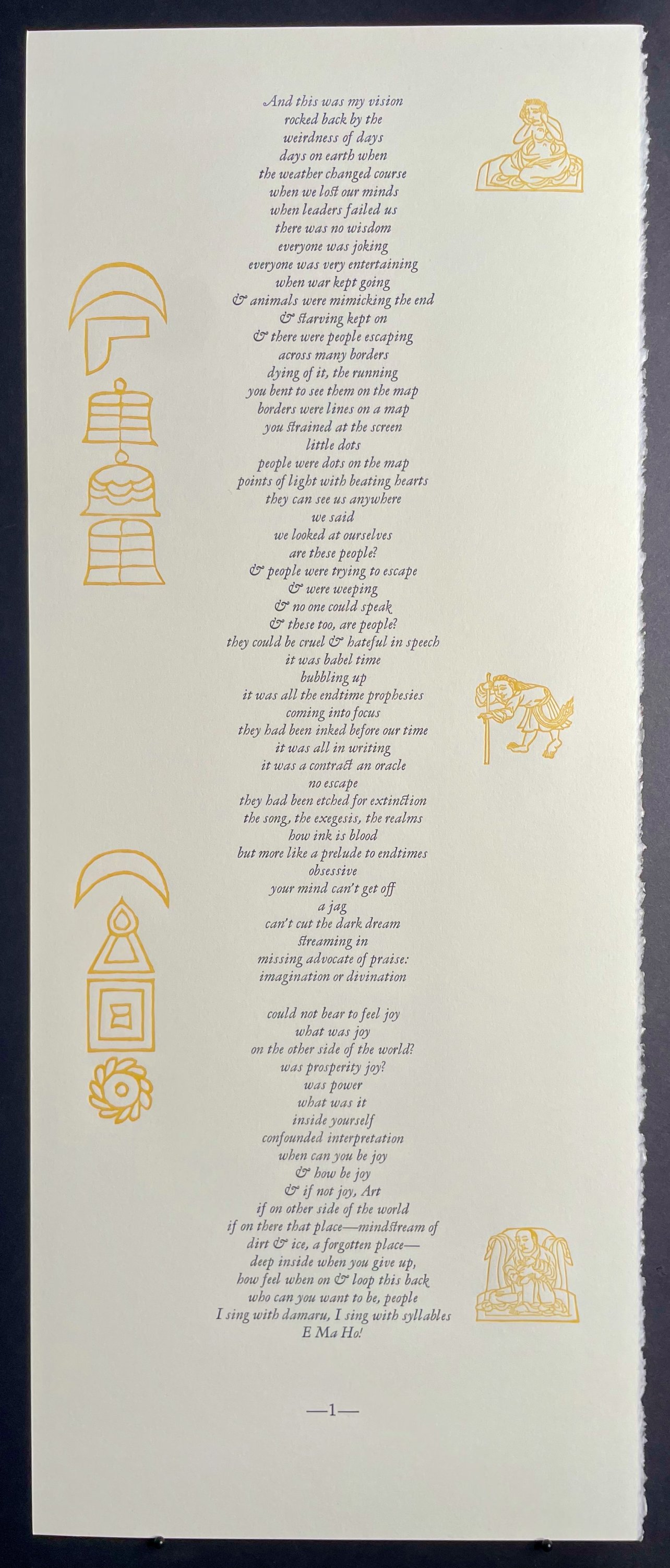
Poet's note: "Extinction Aria" was composed responding to what is known as the cycle -- within the Wheel of Life -- of the six realms in Buddhist philosophy: hell realm, hungry ghost or preta realm, animal, human, warring god, and pleasure-seeking god realm. The text seemed to emanate from a vibrating larynx and dance in the air. The words here are meant to project the tangibility of the psychological state of each realm. Thus the poem is proclamation of a specific insight into “samsara,” Sanskrit for a wandering through the endless cycle of existence, transmigrating lifetime after lifetime. “Extinction” may be interpreted here in both a negative and positive sense. Extinction as in the “sixth extinction” comes to mind; the planet is threatened from many directions by global warming, nuclear war and other ominous threats of the Anthropocene, where humankind is constantly running interference. From the spiritual perspective one aspires to the exhaustion of “ego” and its grasping. “We are here to disappear” is a tenet of Buddhism. I felt a vatic assertive voice on both sides of this inhabiting the poem … the voice of a harpy, a hag, a seer, conjuring images of gloom and doom to wake the world up to itself, and also a consciousness or impulse seeking to disappear. The title may also be read as “extinction air” as in our atmosphere so threatened by unmitigated pollution. The image and insistent repetition of “ink” during the piece was important to the sense of the poem needing to be scribed, physically embodied as spell or charm or transmission. This originally came from a dream that inflected the power of ink as a kind of lifeblood for poetry. These spiritual aspirations can’t merely exist in air. They needed to be written in “blood” and in the minerals of an earthy ink and project a strong visual presence, as they do in David Sellers’ inspired design and rendering. The mantra “E Ma Ho!” weaves in, which is an exclamation of amazement and wonder, and when repeated, carry the blessing of purifying body, speech and mind. The writing of this piece was extremely visceral, performative, in that a pulse of kinetic energy kept pushing the momentum of the language and its images forward. The poem comes off the center of the page; its lines settle down the middle axis as if it is a core of wind, or air, a channel of breath. This centering gives spine and location for the textures and language of the aria.
Additional note by the poet written in anticipation of a May 10 reading/performance and exhibit of “Extinction Aria” in New York City: I felt “on call” with my poem "Extinction Aria" as I wanted to create a kind of sutra for the times, a prayer, an incantation of urgency, a romp through the six realms in Buddhist philosophy. Printer and designer, David Sellers of Pied Oxen, had suggested the idea of a Tibetan stye book- with “pecha,” unbound pages. Pages bound in yellow or red cloth. Images from rubbings of Buddhist imagery. A cover of metal. Extraordinary fantasy of activating what I would write to such heights of complex design and printing! I looked at some examples at the Rubin Museum. I was thrilled as the poem arose with force and purpose. I had worked on meditations of the realms in a book inspired by a pilgrimage to the Borobudur Stupa in Java, Structure of the World Compared to a Bubble (published by Penguin). I would create a more direct performance and invocation in this sense of “extinction” which is a goal in Buddhist practice, as in extinction of ego, but also a double entendre to issues of global warming, nuclear war, etcetera. I think I read aloud a few parts to David to give the kind of emphasis I wanted in the sense of a journey through these radical states of mind that are so keyed to the conditions of our world, and are always relevant. There’s a ferocity in this poem. We had some back and forth, meeting over the details, corrections and the like. I felt attuned to the particular nuances of such a project,and David has created a very "living” embodiment of the process through his own research and his archive of rubbings and printerly devices, the visual sense of invocation to the transformative power of the six realms: hot and cold hell, animal, hungry ghost, human, warring god, and realm of the gods. They are all here in us at all times in all dimensions of space. That’s the feeling I get with this project. He and I are were a kind of "skillful means” making this unique kind of “book.” Perhaps it has something to offer the world. It is a like a treasure and costs dearly as a rarity in book-making & printing, but I also think this poems and project will have a more available use to the reader. -April 7, 2018
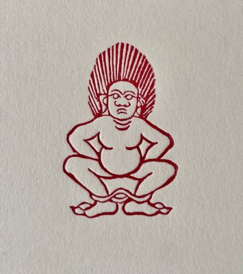
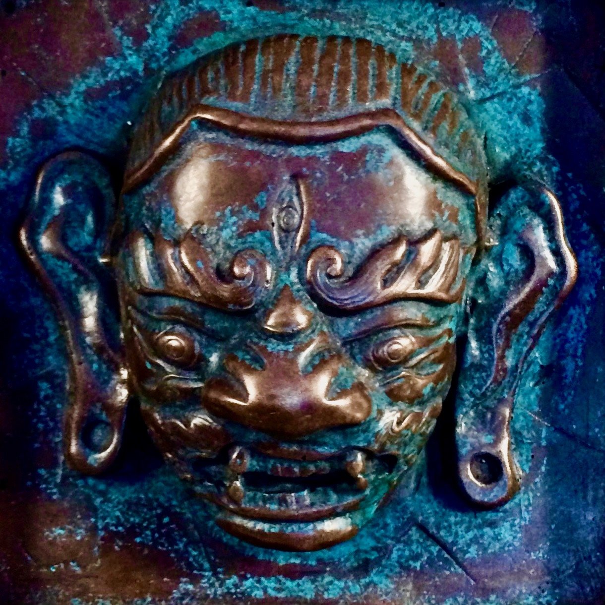
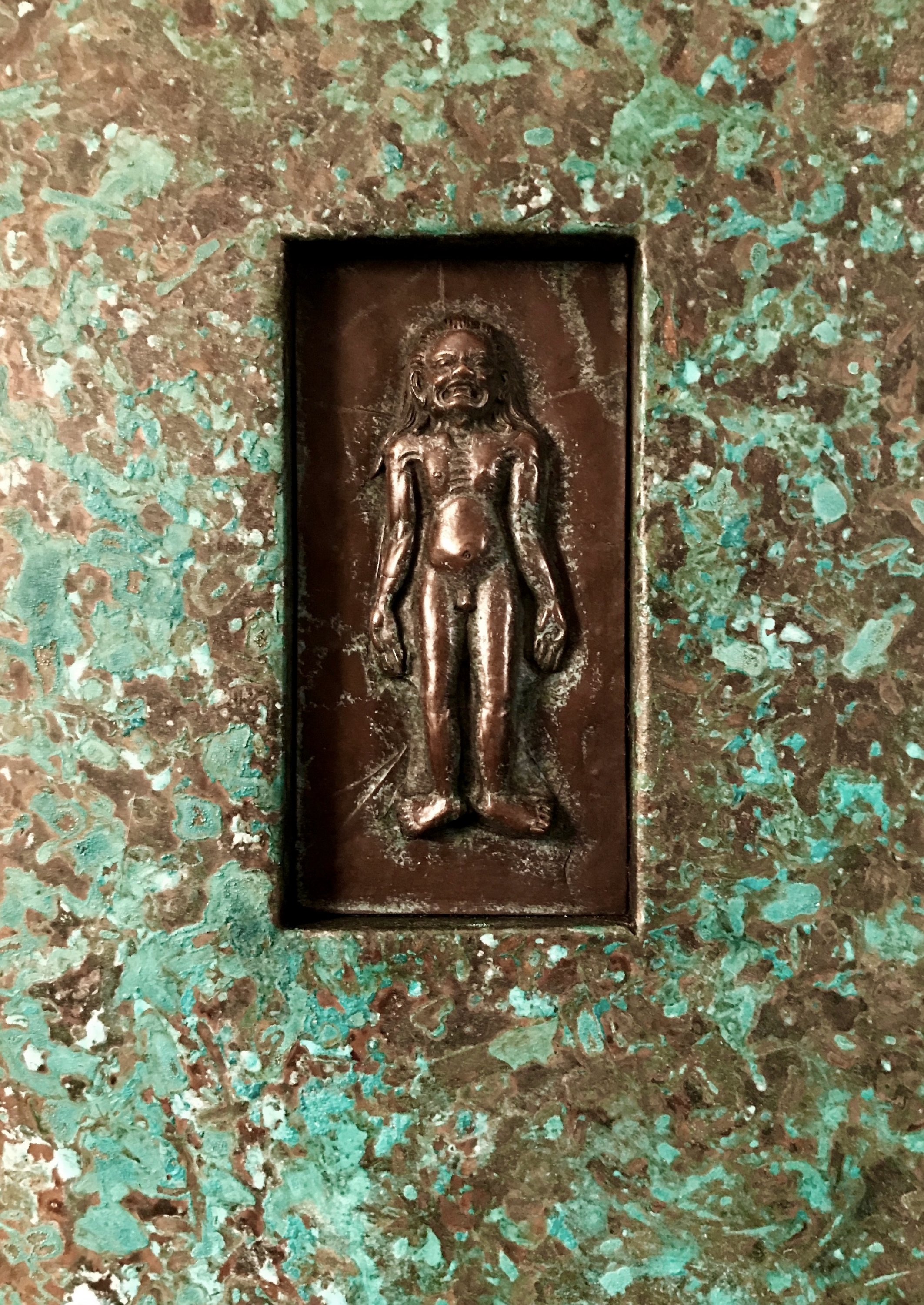
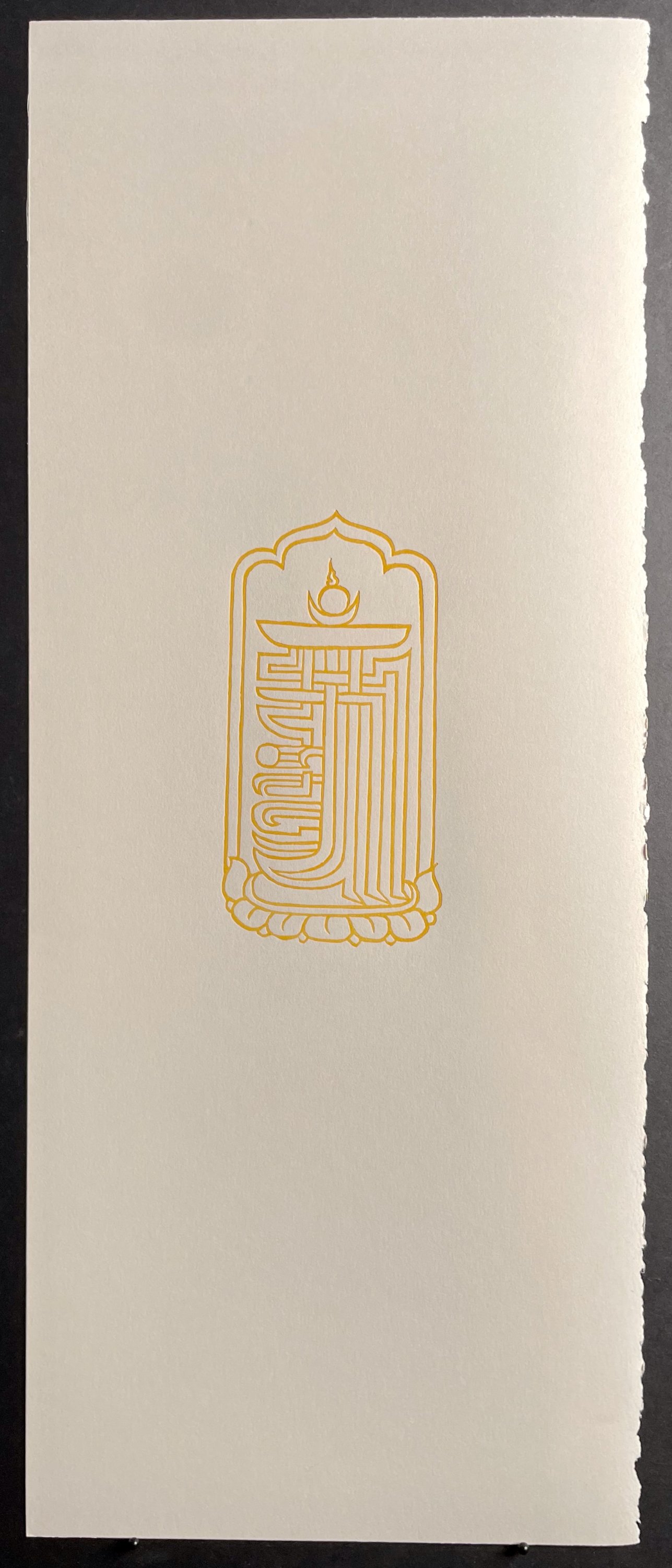
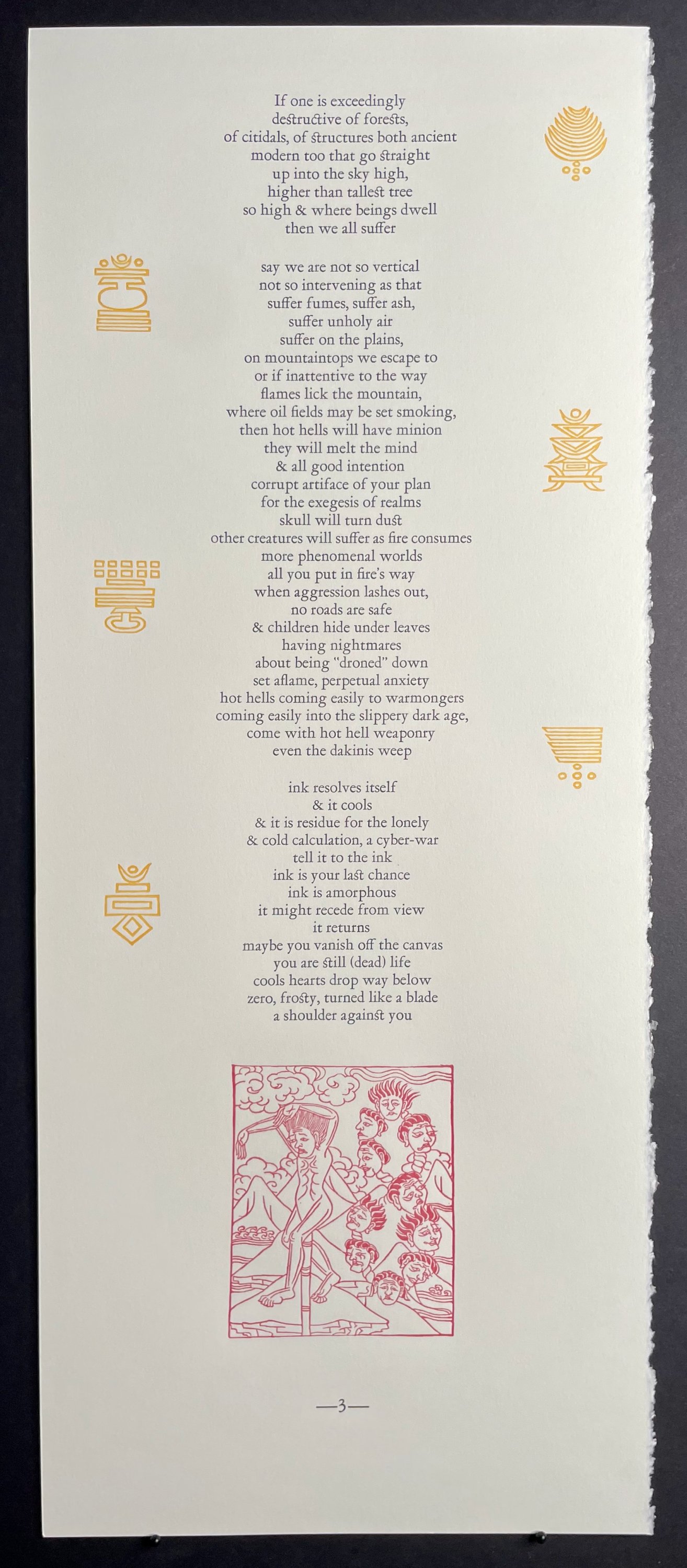
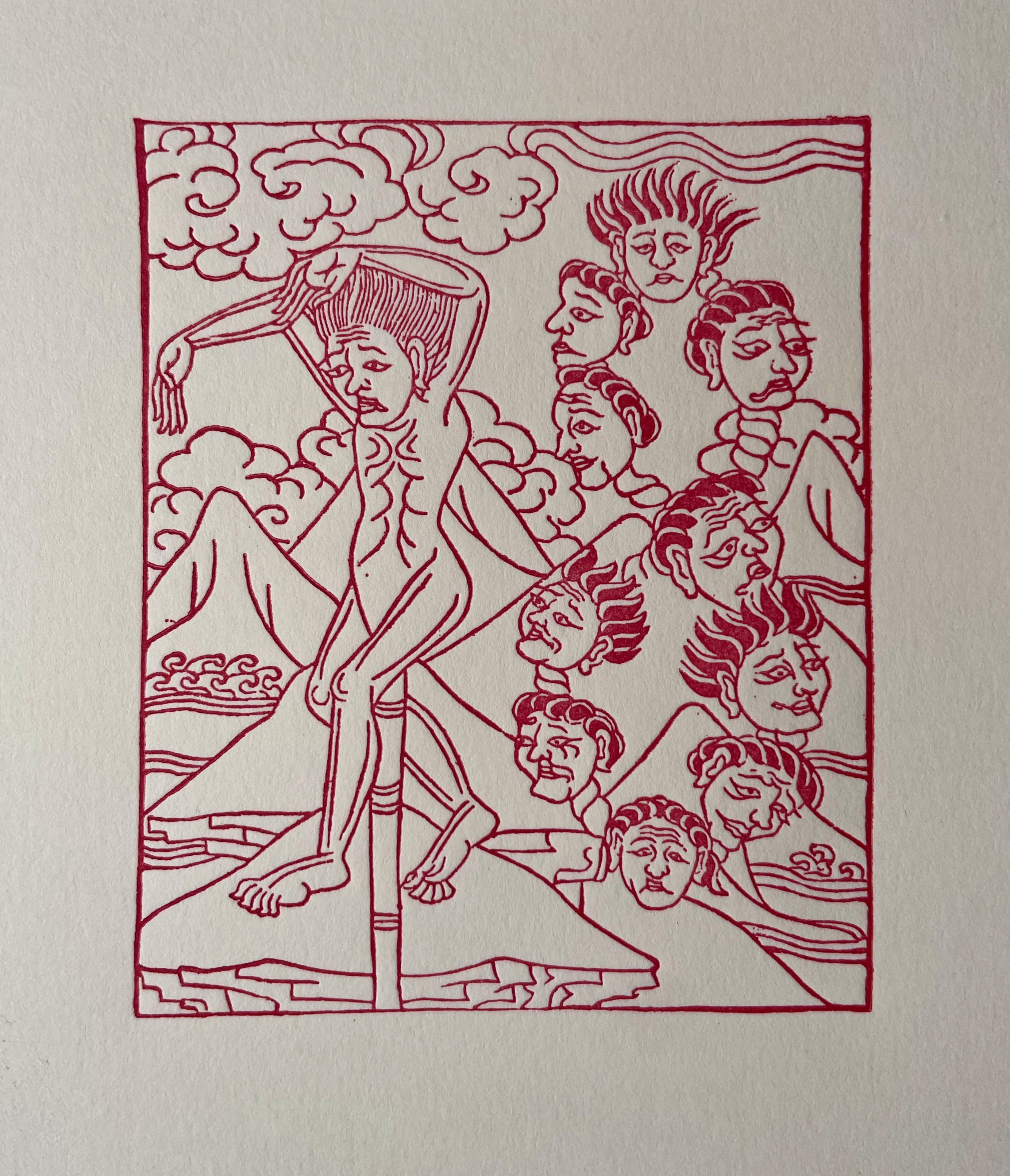
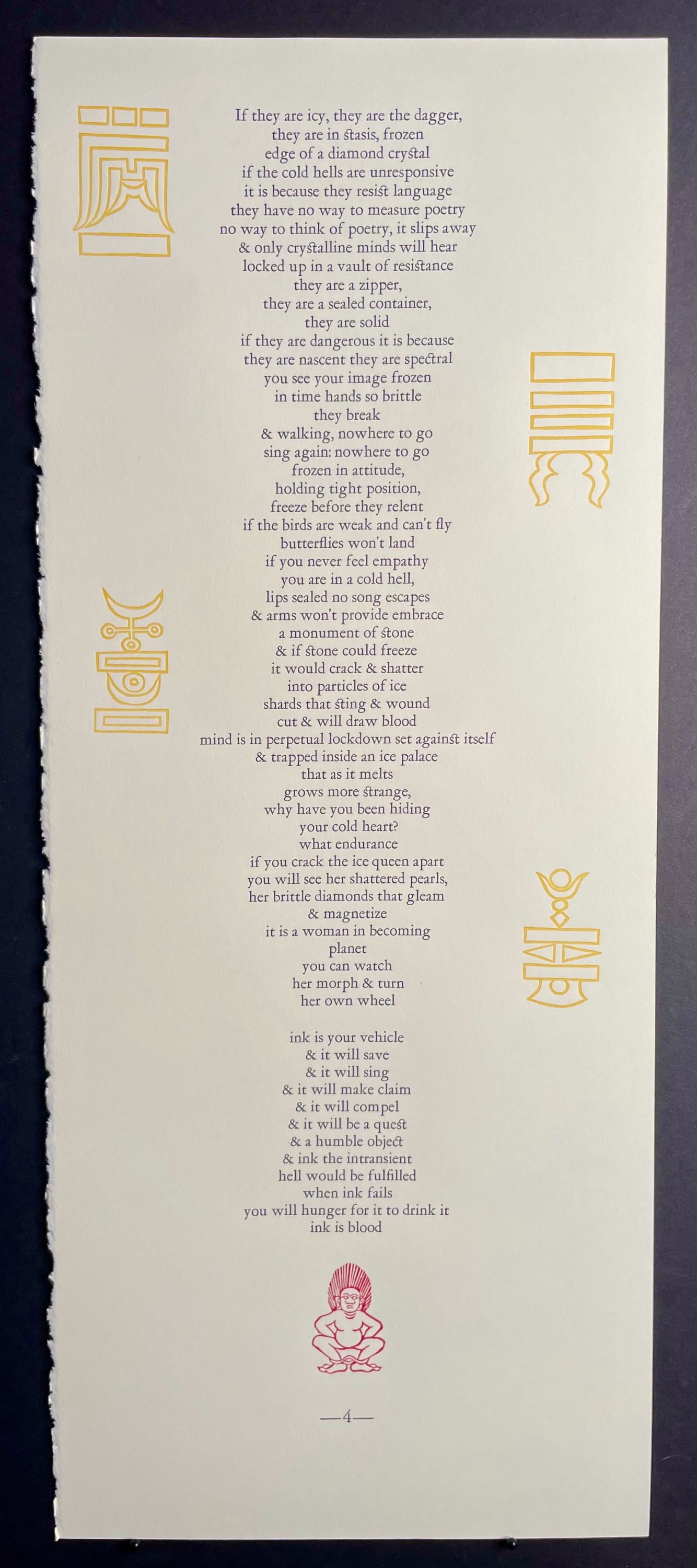
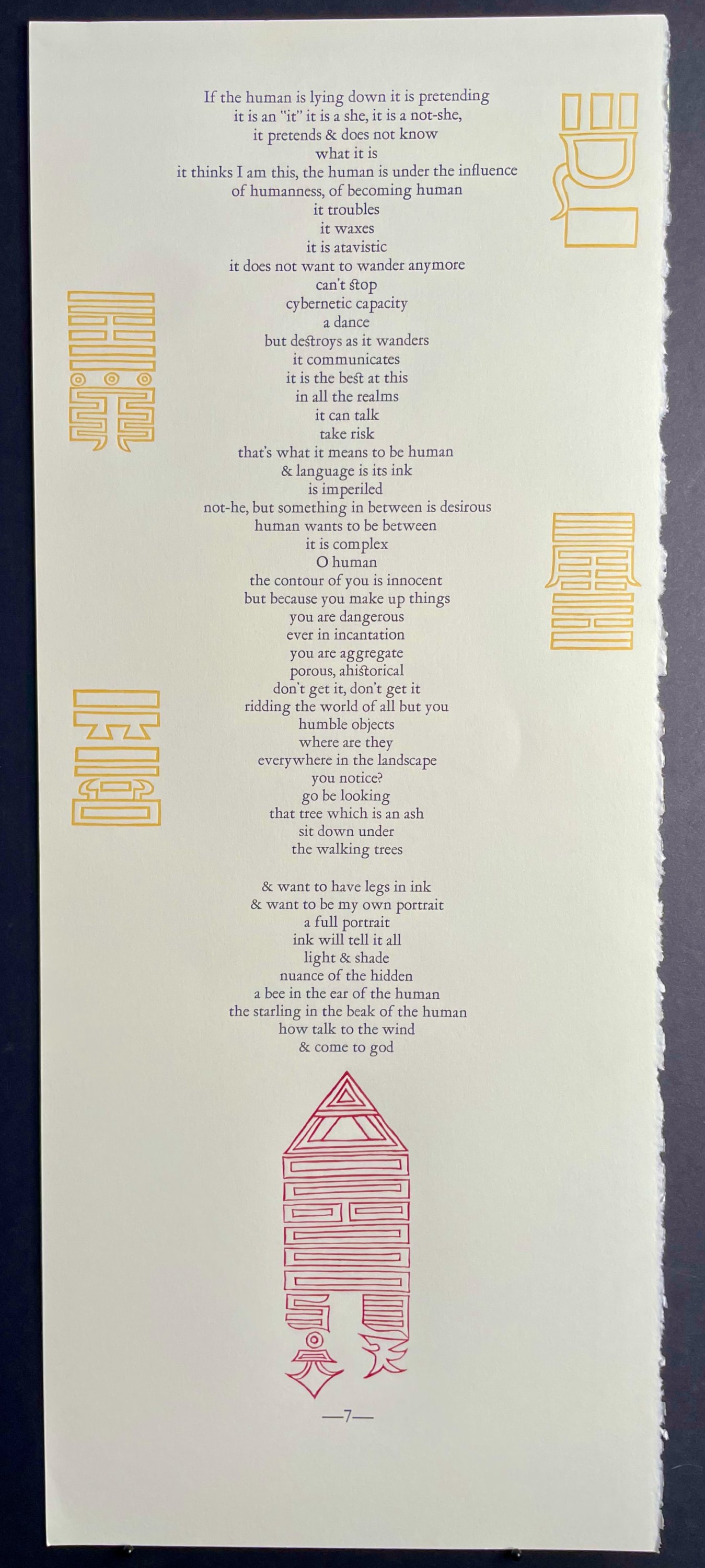
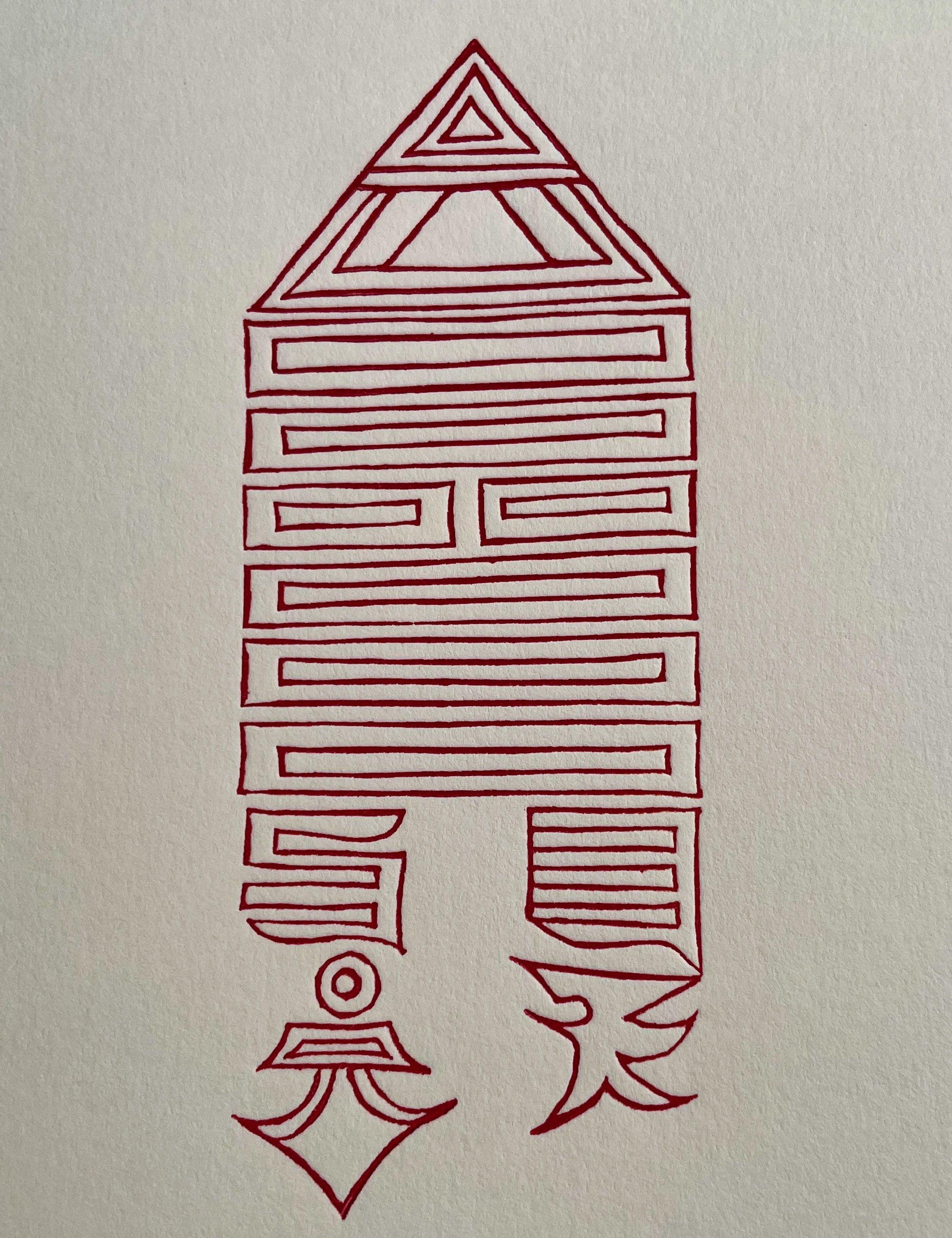
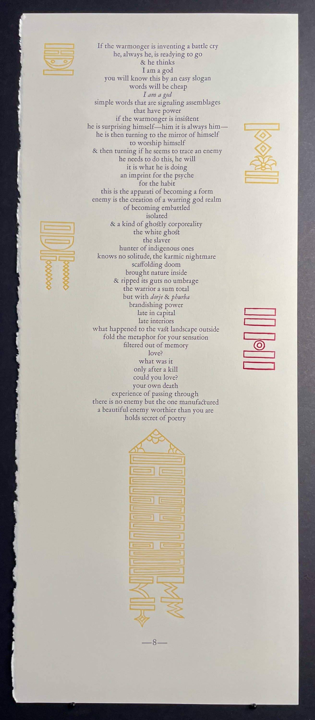
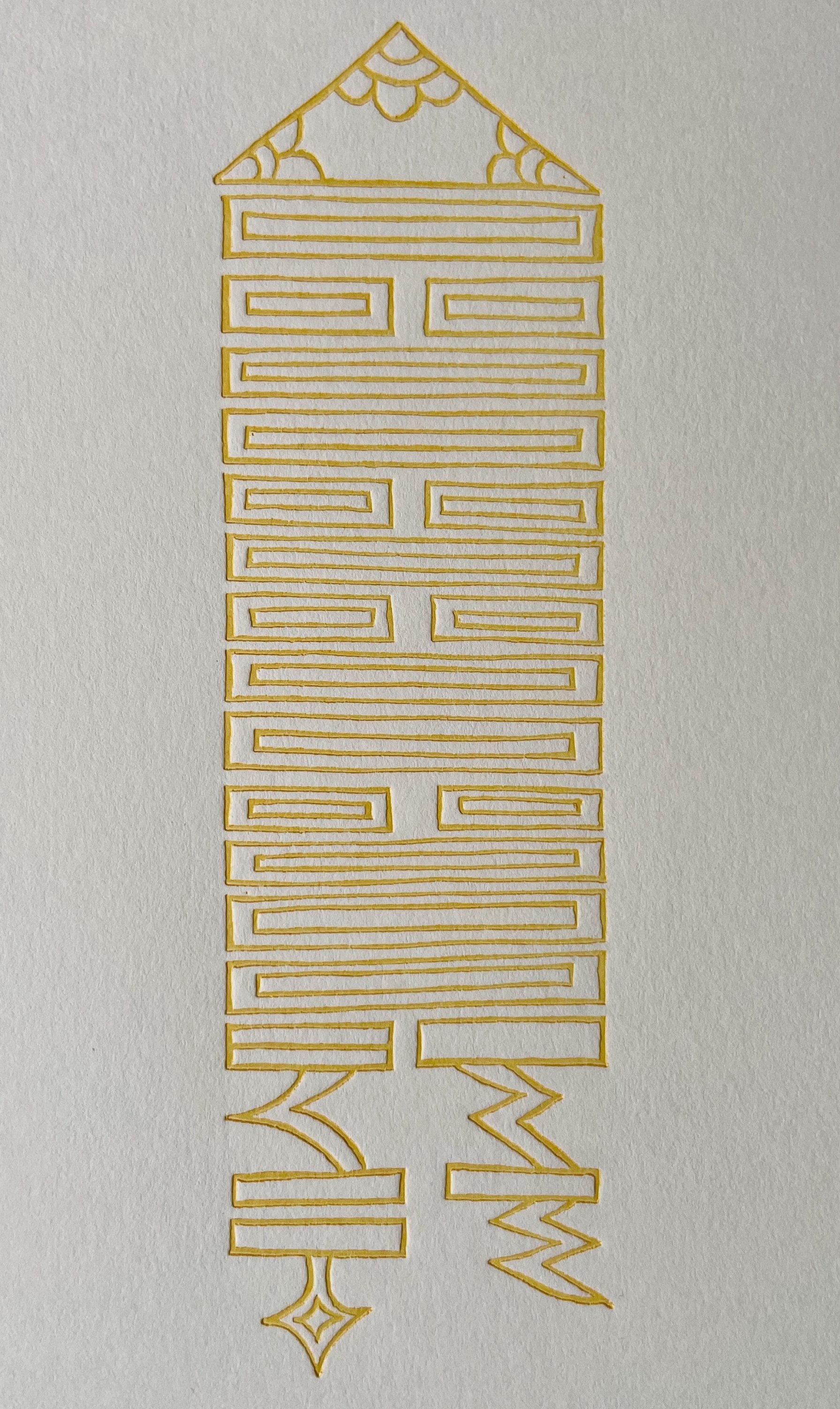
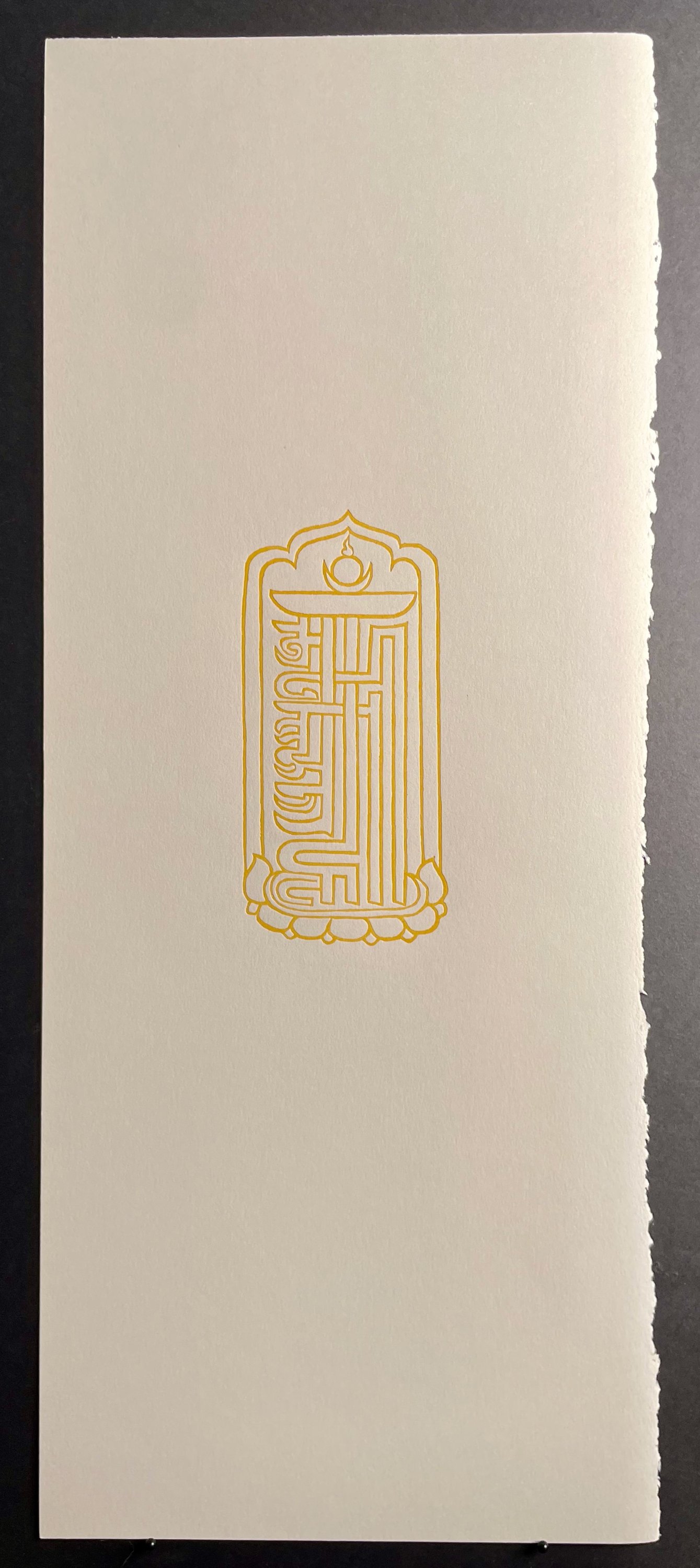
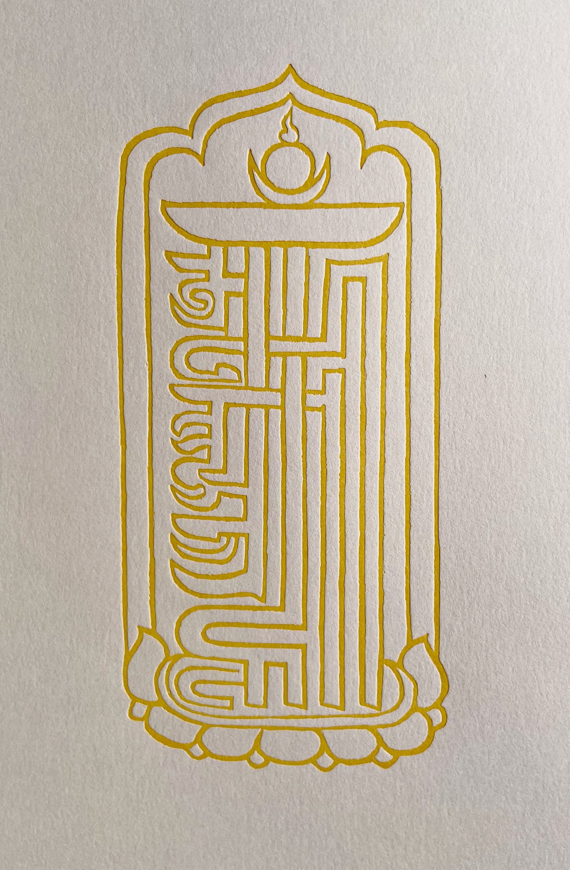
David Sellers' note on designing/making "Extinction Aria": The oblong format of un-sewn printed pages was inspired by traditional Tibetan sutras, albeit with the text running vertically instead of the landscape format. This design serves the additional purpose of allowing an unbroken reading of each stanza, preserving the momentum of the verse. I initially hand-proofed the artwork from Tibetan Buddhist woodblocks carved in the 18th-early 20th centuries, and letterpress-printed from 50 type-high magnesium photoengravings made to the exact specifications of the originals, except for titles and mantras that complete the original designs. When originally printed and empowered and incorporated into amulets, talismans and charms, these designs served to achieve a desired outcome, including good luck and the conditions for happiness, and protection against misfortune and impediments to the force of karmic destiny. The frontispiece and tailpiece are two different versions of the Kalachakra monogram, a symbolically complex, mystical, and profound design constructed from seven interlocking and stacked syllables written in Lantsa characters devised from the Sanskrit alphabet. These powerful symbols give visual form to aspects of the Kalachakra Tantra, as well as its mantra (Om Ham Ksha Ma La Ra Ya Sva Ha). I selected the artwork for this publication from over 350 original woodblocks containing over 800 individual images. The red and yellow inks used throughout the text and in the colors of the fabric wraps and book-cloth are meant to evoke the predominant colors of robes worn by Tibetan nuns, monks and lamas, shades of which in actuality vary according to the occasion, traditions, and local dyes and techniques of individual monasteries. The covers (in lieu of western-style “binding”) are inspired by the carved and decorated boards used to encapsulate traditional Tibetan sutras, based on my inspection of a collection of original sutra covers dating from the 13th to 16th centuries. I cold-cast in bronze the figure inset in the front cover (of the copper-clad version) from a mold I made directly from the centerpiece of a 17th century Tibetan Buddhist gilt-copper garland (necklace) of severed heads and skulls, a block-printed interpretation of which appears in the publication on p. 3. Using the same techniques I cast the figure that appears on the back cover from an original brass torma mold dating from the same period.
Additional information about Pied Oxen Printers can be found at: https://www.piedoxen.com
Pied Oxen Printers
David Sellers
24 East Prospect Street
Hopewell, Nj, 08525
United States
Cell: 609-468-8437
Featured Catalogue
Specialities
Book Arts, Fine Press, Typography
More Information
Booth 30
Shipping and Returns
UPS, FedEx; all items guaranteed as described; returns accepted with exceptions (non-US buyers); payments by wire transfer, bank check or other by prior arrangement.Open Times
By appointment.